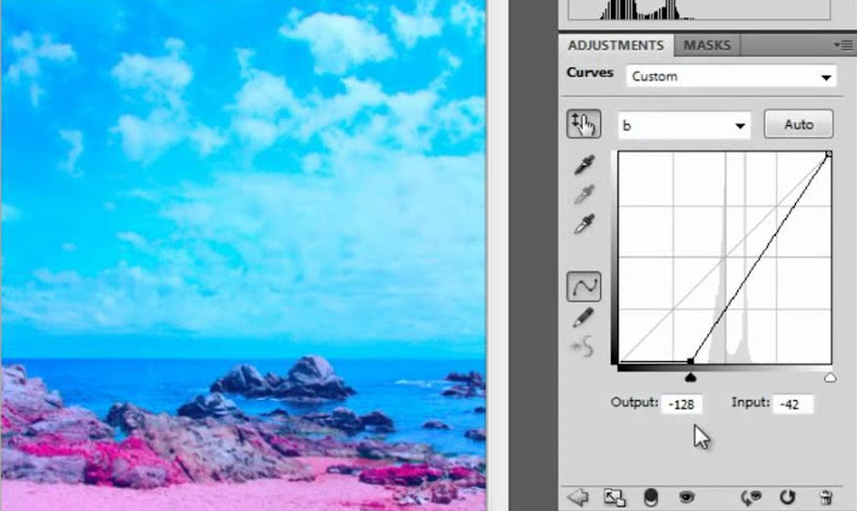
I started my career as a graphic designer in the 1990s, during the rise of 'desktop publishing'. It was a heady time, spurred by Apple's Macintosh personal PCs, and the time when the Knoll brothers founded Adobe and released the greatest imaging software products on the market, Photoshop and Illustrator. It may seem primitive now, but we were living in the future; I remember very well the original 'killer feature,' when Photoshop introduced layers!
In those early days, everything was low res, monitors were lucky to have 4-bit color and were wildly different in output. Bitmap file resolution was low, so the advancement of smooth printing vector graphics in Illustrator was huge. Postscript laser printers were state of the art, but very expensive. I had done quite a bit of digital design and production work on my own for smaller clients. The most killer technology for me back then was the Canon Fiery, which allowed tabloid size high speed full-color desktop printing.
As an enthusiastic early adopter of this technology, I was hired by the famed Minneapolis Ad Agency Carmichael Lynch as a Studio Production Artist. Times were changing, so our digital workflow was incorporated alongside traditional press technology such as stat cameras, Letraset and pasteup. We worked with large offset printing houses, which used film output to print 4+ color separations. Film was expensive to produce, so mistakes were costly. Color accuracy was very important, and a lot of effort was put into standardizing reproduction and viewing. Art Directors were very picky, so a lot of prepress was still done the traditional way, including photo retouching.
Due to the infancy of this technology, color 'correction' was necessary for most scanned images, both for fidelity and impact. Anyone who has used Photoshop knows there are multiple ways to affect the color output, but they vary in control and quality. It's easy to change colors but not necessarily making them look good!
So, digital prepress and color correction was something of a dark art at that time, however, a wizard appeared who could light the way. Dan Margulies was a veteran print production guru, who sussed out the color correction methods for Photoshop, writing books and putting on workshops on how to do it. He was the first I can remember who taught how to use Curves on each color channel to adjust narrow color ranges. Even more mindblowing was LAB color and how to use it to get color corrections that weren't even possible in CMYK!
I wore out my copy of his seminal book, Professional Photoshop, learning as best I could from his examples, until one day CL sent me to attend his weeklong workshop in color correction. I still recall it vividly, Dan was a laconic eastcoaster, who delivered fountains of knowledge in a down to earth manner. It was learning at the foot of the master, and I was thrilled to be able to do it. I remember how afterwards I felt I had learned some inscrutable knowledge that few knew, and I look back now and see that was my first step in the technical understanding of color.
That was a long time ago in a galaxy far, far away, but it still stays with me. Some time after, I decided to move away from Print design and into Interactive Multimedia design, which meant turning from CMYK to RGB. In the years since, the technology and practices evolved, reducing or eliminating many of the issues that we faced. Dan continued his illustrious career, and his impact was recognized when he was the third person inducted into the Photoshop Hall of Fame, after only the Knoll brothers themselves.
Even though my color career took a different direction, I still look fondly back at that period of my career, and appreciate the insight and technical experience it added to my skillset. Thanks Dan!

