As mentioned, I developed colormixing because I was dissatisfied with the color tools available, and found the connection to color theory to be lacking, and I believe I'm far from alone on this! I'm going to give a brief overview of how I see existing color tools and systems. There's a lot to unpack here, so I'll just give a brief overview and maybe expand on it later on.
Since I work in digital media, let's start there. Every graphics program has some kind of color picker. In the early days, you may have only had 64 colors to pick from, and it was kind of like picking from a box of crayons. As computer technology evolved, 8 bit color became the standard, since it can reproduce 16.7 million colors, approximately covering the human visual spectrum. That's a lot of crayons!
Now, you often see three types of color picker; a 'level' picker where you can directly manipulate RGB, CMYK or HSB/HSL; a 'rainbow gradient' color picker, which looks like a spectrum with a gradient running across the bottom. Or you may see a color wheel style picker. Each allows you to pick 'any' color, but the sheer amount of choice, and lack of structure forces people to go with their intuition. This is history repeating itself, since one of the oldest sayings in art is, 'great colorists are born, not made.'
This certainly feels true, and my own thought is this: every artist and designer has a color strategy for each piece they are working on, and that strategy is a personal patchwork of favorite colors, isolated strategies that have worked in the past, some personal adaptations of color theory basics, and using 'canned' palettes from outside sources. Usually, the sign of a good artist or designer is the ability to intuitively use or adapt color combinations by 'eye' or 'taste' which is experience layered over some color training or principles.
There are tons of color palette generators and premade palettes available on the internet, and they can be helpful; artists and designers have a lot to think about while creating, and often color is not at the top of the list, and often gets applied later in the process. It's a tempting shortcut to go and look for premade palettes; there are endless varieties, and then it's just a matter of personal taste and deciding which colors you like or think will work for your project.
This is a standard solution, so obviously it works, however, it comes with a limitation, because the artist is accepting someone else's work and doesn't have the grounding that comes from personally mixing a palette and creating the relationships. (I know, there are only so many hours in a day, right?)

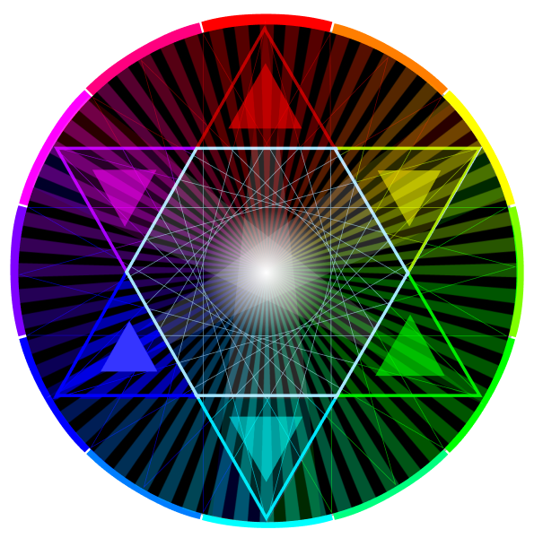
My personal view of traditional color theory is based on my own experience, so YMMV, but here's my take: The standard 'rules' of color theory (complementary, split complementary, triad, etc.) seem authoritative, but they are not telling the whole story. Yes, it looks impressive in Adobe Kuler or other color software that automatically show you the different traditional color relationships, but they are both hiding and missing relationships by trying to automate the process.
Here's what I believe from experience, all colors 'go together' in some way, and there are many more relationships to be found outside of the 'iron laws' of traditional color theory.
The fact is that these relationships were codified in the 20th century after years of speculation, and creating various color wheels and layering philosophy over them, it was a triumph of rationalism that obscured deeper relationships.
In fact, while I show color wheel relationships, and a lot of colormixing is based on oppositional color theory, I believe in using the spectrum as a basis. You don't get neat visuals like a triangle showing split complementaries, but instead gain a deeper understanding of intervals, which is all the traditional relationships really are. It turns out, like music, there are many more intervals or chords that can be created.
Now, I must say that there are many great colorists in the world who have absorbed traditional color theory and understand how to apply it. There are many ways to color. I'm not saying that the traditional ways are totally without merit, artists and designers absolutely can and have gotten good results from them. However, I do believe that RGB-CMY colormixing is a more logical system that unlocks deeper understanding of color and color relationships.
It can be kind of eye glazing when people talk about color theory. Personally, I've found much of it to be theoretical instead of practical. There are different professions who employ color theory to their own ends, and for example, CIE color spaces are important for some, they don't help the artist or designer at all! The same goes for the natural philosophy of color. While Goethe was brilliant in many ways, his voluminous output on color theory left me dry. Ultimately, I see color an artist's perspective, meaning, I want to work with it not talk about it.
I believe most color theory talk is too dense, too abstract or too unintuitive, so much so that a great many people look for shortcuts, in the form of premade palettes or automatic solutions. Again, good results can be had with this direction, but it's cutting corners, and leaving the artist to their 'feels.'
RGB-CMY colormixing is a much more intuitive approach, using the hand, the eye and the application of some principles to 'mix' color values. There is nothing abstract about it, it is very direct, and the key really is the understanding that is created by the hands on process. After all, the same principles are used that underly traditional color theory, but are applied with a different understanding. It's the process of exploration using the colormixer interface that leads to this understanding, and it is my mission to get people to experience the difference.
There's much more to say in the future, so stay tuned!

